Lightroom Tutorial
Everything You Need to Know About the Basic Panel in Lightroom

Nov
Lightroom has many different features available for editing your photos. While these are great tools, and they can yield great results, it can be overwhelming. In order to fully harness this multitude of tools, it is important to first understand the basics.
Lightroom’s Basic Panel can be found directly below the Histogram, on the right-hand side of the Develop Module. The panel is broken up into three sections: White Balance (WB), Tone, and Presence. Within each section, there are a number of sliders that will help you adjust various areas of your images.

White Balance
Sometimes the automatic white balance setting in your camera does not quite choose the right value. This is where the White Balance settings in Lightroom come in. If you image is too blue or too orange, use the Temp (Temperature) and Tint sliders to adjust it.
Temperature
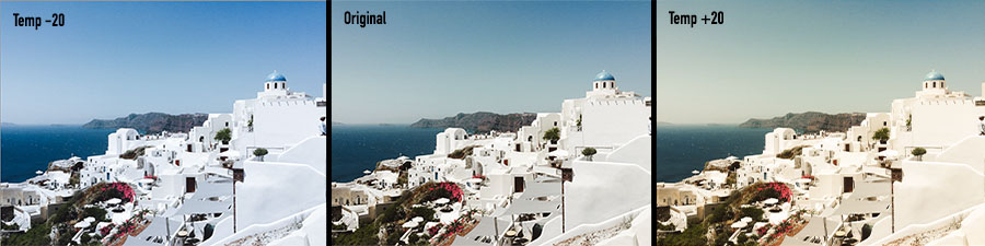
The Temperature slider – shortened to “Temp” within Lightroom – helps you to change whether your image appears warm or cool. When the slider is moved to the left, the image will become cooler and a blue tint will be applied to the image. If the slider is moved to the right, the image will become warmer and a yellow tint will be applied to the image.
Whether you want your image to be warm or cool completely depends on the light source. For example, photos taken at midday or in the afternoon may have a blue tinge, while photos taken at golden hour will have a more yellow appearance, because of the difference in lighting. Use this slider to adjust the white balance in your image until you are happy with the results.
Tint

This slider works in tandem with the Temp slider. As you slide the Temp back and forth, your white balance will get closer to what you want, but it may result in an image that appears slightly green or red. Use the Tint slider to balance out those tones and bring the colouring of your image back to the proper value.
If you want Lightroom to do some of the heavy lifting, you can use the eyedropper icon on the top left. Select this dropper, then click a light gray (not pure white) area of your image. This will automatically adjust the white balance in your photo, and give you a good starting point that will actually get your pretty close to the look should be aiming for.
Tone
This section of the Basic Panel is where you can adjust the light in your images, and the range of tones found in your image. This is where you start to get into the more detailed edits.
Exposure

This slider is a global adjustment that affects all areas of your image, and goes a long way towards making dark images lighter, or light images darker. It is extremely useful in correcting any kind of overexposure or underexposure. When editing your images, you will have to adjust more than the Exposure slider, but this is a great way to get started with your edits and applies a good overall adjustment. Once you have adjusted the exposure, you can move on to the more specific adjustments to fine tune your edit.
Contrast
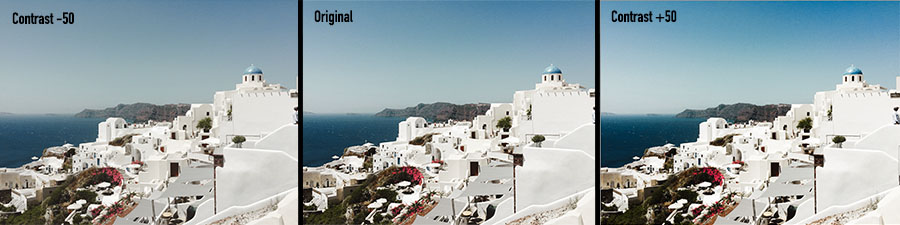
Just like the name of the slider implies, this adjusts the contrast in your image. Move the slider to the right to increase the difference between the shadows and highlights in your image, and move it to the left to decrease this difference.
The Contrast slider is good for making minor changes, but it does not offer much control over which tones are considered light or dark and how they are affected by the changes in the slider.
Highlights, Shadows, Whites, Blacks
These tools are among the most powerful in Lightroom, and can be real lifesavers. Each of these 4 sliders allows you to individually adjust the dark and light parts of the image. You can use the whites slider to adjust the pure whites in your image, the highlights slider to adjust the brighter tones, the shadows to adjust the darker tones, and the blacks slider to adjust the pure black tones. With these sliders, you can rescue areas of your photo that have become totally blown out. You have really detailed control over your edits and the outcome of your photo with these sliders.
These sliders work well in combination with the Contrast slider, or the Tone Curve Tool. Careful adjustments to the Whites and Blacks sliders can have a similar effect to the Contrast slider, just will more control over the finer details. You can also see how the tones in your image are distributed by looking at the Histogram above the Basic Panel.
Presence
Once you have adjusted the white balance and tones of your image, the next section in the Basic Panel is the Presence section. In this section, you will find sliders to adjust Clarity, Texture, and Dehaze, as well as Vibrance and Saturation.
Clarity
The Clarity slider is probably one of the least understood sliders. While it may appear to provide results similar to contrast, it differs in that it does not adjust the overall contrast of an image, but instead adjusts what is known as edge contrast. Wherever there are harsh lines or edge, moving the Clarity slider to the right will make them stand out more. If you slide this slider to the left, the image will become less defined and have an almost soft-focus effect.
Dehaze
The idea behind this slider is that by moving it to the right on images with a bit of foggy or hazy appearance, you can remove some of the issues caused by lens imperfections or atmospheric instrusions.
Texture
Moving the Texture slider to the left will reduce medium size details – which is useful for minimizing skin texture or smoothing surfaces – while moving the slider to the right will enhance these medium-size details – which is useful for intensifying texture of foliage or hair. With this slider, you can create much more subtle adjustments than you can with the Clarity slider, although they may appear to do almost the same thing.
Vibrance
The Vibrance slider is the one to use if you want to make the colours in your image more intense. While the Saturation slider adjusts the overall colour intensity of the entire image, vibrance works by making duller colours more vivid. It is also smart enough to leave skin tones alone so you can make a scene a little more interesting and colourful without worrying about ruining your portraits!
Saturation
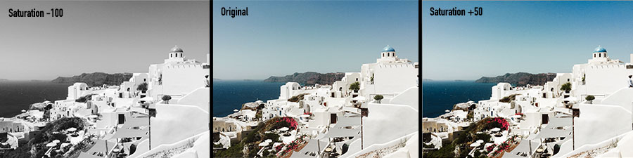
This slider can be used to take dull images and add a massive punch of colour, or used to turn vibrant images into faded black and white versions. This slider is powerful, but it is also easy to overuse. If you push this slider too far, you may find your colours shifting, losing detail, and that a colour cast has suddenly appeared in your image. Saturation is a great tool, but use it wisely!
Now that you understand the basics of Lightroom, you are ready to start editing your photos! Get comfortable with the Basic Panel and then experiment and see what you can do with Lightroom’s more advanced tools.