Photography, Uncategorized
8 Tips for Using Colour to Create Stunning Photographs

Mar
Colour is an extremely powerful tool in photography. The colours in your photo can determine which emotion might be portrayed by your image, they be used to create the composition of your photo, make your subject pop, and so much more! With that being said, though, it is crucial that you use this tool effectively and make sure the colours you choose are actually working to your advantage, rather than bringing your photo down. Keep reading below for some ways you can strategically use colour in your photos and take your photography to the next level!
1. Use Contrasting Colours to Add Pop to Your Shots

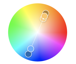
Using contrasting colours can make your photos pop! The strategy for finding colours that are contrasting but still look good together is to use complementary colours.
Complementary colours are colours that are found across from each other on the colour wheel. These pairs are red and green, blue and orange, and purple and yellow. Complementary colours create powerful tension in your photos, as they each work to make the other pop. Play around with these colour pairings and see what types of effects you can create!
2. Use Analogous Colours to Add Harmony to Your Images

While complementary colours are great for creating strong contrast in your photos, this is not always the effect you are going for. If you want a great colour scheme for your photo, but want to create a more harmonious feel, use analogous colours.
Analogous colours are colours that sit next to each other on the colour wheel. Instead of clashing, they convey a sense of harmony and create a much more peaceful image than using complementary colours.
If you are unsure which colours will work together, use a colour wheel. A great online tool for both photographers and designers is Abode Kuler. Here, you can create different colour schemes and see all the colours side by side, so you can see exactly how they will all look together!

3. Use Colour in the Rule of Thirds Composition
The colours in your photo are also an important element in the composition of your photo.
To keep your photo from being too busy, try to photograph scenes that only have a few obvious colours. In general, three colours is a good number to aim for, especially if one of them is dominant compared to the others. When in doubt, though, reduce the number of colours in your shot! Simple colour schemes make for the best photos!
You can also use the colours in your photo to balance it. Split the scene into thirds using horizontal blocks of colour or patterns – following the Rule of Thirds principle – as this will create a powerful and well-balanced image. Use leading lines, repeating patterns, and blocks of colour to keep your photo balanced and make sure it is properly composed.
Along with your bright pops of colour, though, make sure you have colourless areas to truly balance your photo. The neutral (black, grey, white) portions of your photo act like negative space in images that are full of colour. Have these areas in your photo as well keeps the colour in your photo from becoming too overwhelming, and ensures your photo is still properly balanced.
4. Keep Your Subject More Colourful Than the Background
By keeping your subject more colourful than the background, you will help your viewer remain focused on your subject. To achieve this, make sure your subject’s colours are bold and saturated against a more faded background. To make your subject stand out even more, place it against a plain black or white background!

5. Understand Dominant and Receding Colours
Understand which colours are dominant and receding, and how to apply these principles will also help you use colour more effectively in your photos. Warm colours (red, orange, and yellow) are dominant, as they demand your attention first and seem to come forward in a photo. Cool colours (blue, green, and purple), on the other hand, are receding, and appear to fade into the background more. They are softer and more calming than warm colours. You can create great visual depth on your shots by strategically using dominant and receding colours.
6. Use Colour to Evoke Emotion
In the same way that different colours can be dominant or receding, colours can be used to evoke emotion. Here are a few emotions that different colours can evoke:
Red: energy, excitement, passion, anger
Orange: warmth, happiness, enthusiasm
Yellow: cheerfulness, friendliness, creativity
Green: calm, natural, balance, growth
Blue: peace, cold, sadness, trust
Purple: spirituality, mystery, luxury
Compare the two photos below, for example. Neither one of them has people in it that are outwardly expressing emotion, but don’t they give off completely different feelings? The bright yellow of the left image is happy and exciting, while the blue tones in the photo on the right give off peaceful serene feelings.

Whether you want your photo to stir up intense feelings of anger or passion, or instill a sense of calm and happiness, you can use colour to do so! Choose your colours strategically and work them into your composition in such a way that they create the desired effect. Play around with different colour combinations until you get the results you want!
See Also:
Indoor Photography Tips & Locations
Lightroom CC vs. Lightroom Classic
What are Shutter Speed, ISO, and Aperture?
7. Shoot in RAW
As with any photos you are taking, it is best to shoot in RAW format. By shooting in RAW you give yourself much more freedom when it comes to post-processing. While the colours may have been vibrant in real life, that may not always come out in your camera, so you want to make sure you are able to edit the elements in order to make the colours look exactly the way you want and produce the best photo possible!
8. Use a Polarizing Filter
Polarizing filters act like sunglasses for your camera lens. They will add depth to your images by saturating the colours and reducing reflections. This makes them excellent for shooting landscapes, for example. They will darken skies and make colours pop, while also eliminating glare and reflections on glassy surfaces or water.
The use of a polarizing filter will help those vibrant colours pop and make your photo look amazing!
Now that you know how to best use colour in your photos and which tools to use to help you capture those colours properly, get to work! Start experimenting with different colour combinations, compositions, and shots! The possibilities are truly endless!